Thursday 5 December 2013

the Inbetweeners is alright.

The bulk of the comedy of The Inbetweeners is 'cringe comedy', wherein a character (or characters) do something stupid and/or embarrassing things and they're caught out on it by others. For example, when Will is kicking and screaming about how three 'inconsiderate arseholes' jumped to the front of the line of a rollercoaster, only to find out that those three inconsiderates suffered from Downs Syndrome. That's one example of many scenes in which one of the four characters indulges in 'cringe comedy'. The name derives from the expression the viewer makes when witnessing such scenes.

The main reason that I can pin down as to why people watch The Inbetweeners is catharsis. Viewers can find comfort in this show as they can bask in the glory of not being this stupid. In life, you may feel worthless and insignificant, but hell, at least you're not this stupid. It sounds mean to say, but it really is true. These four characters, ranging from socially awkward to single-digit IQ recipients, indulge in the most stupid, narrow-minded, stereotypical acts, surpassing humour and reaching the point of catharsis. People may call it cheap comedy or stupid comedy, but it's stupid comedy made by smart people. It's made by people who understand the 'inbetweeners' of that age, and put those characters in situations they can't handle.

The 'inbetweeners' the title is referring to is the group of students that are too dumb to be 'nerds', and too pathetic to be 'cool kids'. They have no direction in life and aren't even enjoying the time in school that they should be. Even the smart one of the group, Will, fails his exams and becomes like them. With students of this age range, there is a lot of raunchy comedy on display. With Jay constantly lying about his sexual encounters (or lack thereof), Simon constantly chasing after the same girl (whom he throws up on her little brothers head), Neil who is constantly ridiculed about his father being 'gay' (whose sexuality remains undisclosed and ambiguous), and Will being too socially awkward to attract anyone of the opposite sex (but he does so anyway, ending disastrously). This inclusion of raunchy comedy strangely appeals to a younger demographic who enjoy sex jokes without understanding the real context of the joke. These 4 teenagers are completely pathetic, but someone immature might mistake them as being 'cool' because they talk about sex a lot.

I've watched every episode of The Inbetweeners (including the movie), and it mainly follows the same formula: one suggests doing something out of their comfort zone, they attempt it, they fail at it but try and act like they know what they're doing in effort to be 'cool', and they get themselves into trouble. To me, that's perfectly fine, as the four characters respond differently to different situations, and during the 20 minutes they have entertaining dialogue and opinions, distorted and uninformed as they may be. It might be offensive and often cruel, but it offers a realistic and relatable interpretation of the modern day, A-level burnout.

Friday 29 November 2013

'Hot Fuzz' extraction.

The narrative in this extract fits the action adventure genre mainly because of the main character and his actions. He only has 4 lines of dialogue in the whole extract, but Edgar Wright understands that actions define a character. Firstly, he rides on a white horse (or as Florence pointed out; a grey horse) through a conservative English town. White generally symbolizes purity and goodness, like the white dove from the Biblical Noah's Arc story. There's a low angle shot, emphasizing his dominance and presence over the local towns folk. He seems rather calm and relaxed for a man wielding dual machine guns into a village which he knows is hostile, specifically to him, but he remains stone-cold cool in a situation of almost certain death, chewing a toothpick as he passes by.  He's positioned high, he acts suave and casual, all the while walking into a ticking time-bomb of a village. He's accurate and professional, almost as if 'pro' was the main tenant in a character termed 'protagonist'.

We can also identify with the pastiche used in Hot Fuzz. For instance, if you've watched any Western film ever, you can recognize the signature convention used in this extract. He strolls into town on his white horse, chewing a toothpick and wielding high-powered rifles, drawing the attention of all the townsfolk with the twangy guitars and harmonicas dwindling in the background. From this, we can instantly identify the action/adventure themes in this extract. We're familiar with Clint Eastwood and Django enough to know that any film imitating it is an action film.

Thursday 21 November 2013

the IT crowd is alright.

I don't like canned laughter. At all. Woody Allen summed it up in Annie Hall

Rob (To Alvy): We do the show live in front if an audience. 
Alvy: Great, but nobody laughs 'cause your jokes aren't funny. 
Rob: Yeah, well, that's why this machine is dynamite. 

That sums it up for me. Canned laughter is a sign that you should be laughing, but you aren't. It's forced. A good comedy makes you laugh because it's funny, but a lazy comedy has to indicate when you should be laughing. It's what put me off Friends, it's what put me off Big Bang Theory (along with a bunch of other stuff I wont get into), and it was what initially put me off The IT Crowd. The bulk of the humour in  The IT Crowd revolves around making fun of Chris O'Dowd's and Richard Ayoade's socially awkward, introverted man-children and all their cringy social encounters, and Katherine Parkinson's computer illiteracy and her incongruity in an IT department.  

Richard Ayoade is always funny, but the actual jokes are often slapstick, much like 'good old-fashioned comedy', as in it's very obvious and heavy-handed lacking subtlety and wit. From I've seen, the plots twists and turns are dictated by how deep the introverts can dig themselves into the pit of social awkwardness, channelling the Mariana Trench, but it can sometimes be funny or at least mildly humorous. There is always potential comedy in three people who know little about social interactions indulging in social interactions. 

As far as introverts go, there are a wide range of introverts that The IT Crowd depicts, unlike The Big Bang Theory which simply depicts all nerds and basement-dwelling troglodytes. There's the buttoned-up, 31-but-lives-with-his-mum stereotypically geeky type, the lazy, sloppy, poorly-dressed introvert with the work ethic of an overweights house-cat with no legs, and the obligatory woman character who has to be grouped with these nerds, but is no more introverted than them. She may be a Luddite, but is mainly independent who doesn't fall to gender conventions like many other Luddite-esque women. It's mostly obvious and silly, but it make me laugh quite a few times, so if it's intention was to make me laugh, then it succeeds as a comedy, I guess.

Saturday 16 November 2013

fragrance advertisement analysis (final copy).

Unlike other adverts who make women seem defenseless and powerless yet pretty and seductive, an advert almost 100 years old can prove that you can make a feminine figure who also seems powerful and authoritative. She can appear this powerful figure whilst also keeping little touches of femininity, like the red lipstick.

She's positioned highly, dominating the entire image with her presence. She has her hair tied back, looking as if she is in control of herself and not loose or careless; she appears a taut woman. The colour red is a strong, vibrant colour, and is often used to emphasis a symbol of importance and/or power, see the Red Army, the Red Cross, the Chinese flag, and the main colour pallet for 1984. It's a powerful colour, and here it's used to empower the subject of the image: the woman. She's not flimsy or objectified, she has power and dominance. She's not just dominant over the image, she's dominant over herself. She doesn't succumb to societal pressure to be 'pretty' or 'hot', she's her own woman. She is independent. She has power.

I elaborated upon the idea that she is a powerful woman, but she is not an entirely masculine figure, as she still keeps touches of femininity, like her lipstick. This shows that a woman can be powerful and headstrong, but she can also be a woman, as power isn't synonymous with masculinity either. This is breaking the historical societal code that 'Men are men and women are women', in which men are the laborers, the founders and the pioneers, and women were merely an object to them, like a trophy or an achievement. This shows that a woman can possess all of the aforementioned traits, yet still be beautiful and seductive and all the other traits of the average woman. Yes, it is possible to be both, yet most advertisement, film and video games think combining these two characteristics is impossible.

The use of contrasting colours in important. There's contrast in the colours in the crown behind her head (black and white), but there's also the duality in the colours on her face. It could symbolise the contradiction in her character; she possesses traditional female qualities (the red lipstick and the plucked eyebrows) whilst being the aforementioned powerful figure. The colours and shades are sharp and precise, which could mirror the characters mannerisms.

Wednesday 6 November 2013

final choices.


Points:

  • Empowerment
  • Minimalism
  • Colours
  • Cultural relevance
  • Messages


The message of this 50's advert is that a man, no matter his physical appearance, will get the woman he wants and the treatment he wants. He's a large and hairy man, yet gets a conventionally attractive woman massaging his back, with the obvious help of this perfume. The man is represented
  • Sexuality
  • Messages
  • Objectification
  • Target Audience
  • Historical Resonance


  • Originality
  • Relatability
  • Famous actress appearing down to earth
  • Comparison to other adverts
  • Messages

Tuesday 15 October 2013

fragrance advertisement analysis (early draft).

 The 'Vega' advertisement is from the 20's, but by then, Guerlain have already been around for almost one hundred years, so I guess you could say that Guerlain have had some experience in the field of perfume advertising. There were a multitude of advertisements I could have chose from the 20's, but I chose the minimalistic one because of how different it is. Firstly, in the 20's, photography was becoming more mainstream. Ad agency's wanted to have the best technology in their advert's to seem progressive and fresh. Guerlain were either ignorant of recent innovations, or this was intentional. They made a simplistic and minimal poster with a mere six colours. Guerlain proved that they don't need fancy new technology to make a powerful advert, as they're skilled enough to do so with a bare-bones simple design. Unlike the other perfume adverts I saw that demean and objectify women, this empowers women. This shows a woman with a spiky chess piece behind her head, empowering her as an authoritative and threatening figure. You can see that she's the higher figure in this poster; that she is above all. She's not objectified or demeaned by anyone; she looks like she's the type of woman that could run a business, or a state, not the type of woman that gets drunk at parties and sells herself. 'But Guerlain' they shriek, 'how can I be like this powerful and competent-looking woman?' Simple. Buy their perfume. That's obviously what they're selling, because you have to sell something in this industry, so why not sell something positive and less demeaning?


After feeling positive about the advertising industry for a short moment, let's move on to Centaur, a surprisingly sexualised image for the 1950's. I thought the 50's was a relatively conservative decade, and the liberalism emerged a decade later, but this advert is making me feel differently about that time period. Of course, it was a sexist time, so the rampant sexualisation of women wasn't uncommon, as displayed here. Of course, retro and nostalgia sells, as proven with most Indie Games and period dramas like Mad Men or Downton Abbey or Boardwalk Empire, but Centaur is taking retro to its logical conclusion. Instead of basing the advert 50 or so years into the past, it goes Ancient Greek. I've noticed that perfume adverts feed off needs like desire and lust. This one, for example, depicts an old man who probably wouldn't have been a ladies man, using Centaur, and then becoming a ladies man. This shows that if you use Centaur, you will become attractive and desirable with no real effort. It's slightly depressing how our society wants everything the easy way. For instance, 'The secret how to lose weight fast!' or some other demeaning untruth for the shallow. In this case, the advert is selling the idea of having beautiful women for the price of a perfume bottle. Anyway, Centaur is actually a Greek Mythological creature that is half man, half horse, or put simply, 'Half man, half animal'. The name of the perfume is subtly alluding that it's okay to let your animal side go.


Contrary to popular belief, women aren't the only group of people marginalized and stereotyped. What could be more obvious than a man's clenched fist as a fragrance bottle to sell masculinity and male pride/superiority? It uses typically male colours, black and blue (slang for the bruising of a persons flesh) and uses a block capital, bold and rugged font as its title. It's the most male-power fragrance I've seen in a while. A clenched fist represents a fighters fist, almost explicitly saying that this cologne will strengthen you. If you buy this cologne, you will become one of 'the brave', further selling exclusivity and desire.

The 'Vega' advert is almost 100 years old, yet little has changed. These three fragrance adverts all sell similar desires, whether it be power, ownership, masculinity, and yet a sense of falseness. Of course spraying cologne on your clothes wont make you stronger, of course spraying perfume wont make you powerful, but they want you to think that it does.

Thursday 10 October 2013

stock characters in film.

the chief. - Jules Winnfield - Pulp Fiction
Throughout the film, we have a constant sense that Jules (played by Samuel L. Jackson, well enough for him to be nominated for an Oscar) knows exactly what he's doing, and he does so with extreme confidence and calmness. When we first meeting, he has a human conversation with his partner (John Travolta) about burgers, above all things. They look like they're just driving to work, until you realize they're hitmen that recite Bible verses before killing their targets, as well as enjoying a good burger. It creates an effective contrast that most action films fail to see. We have to have a sense of humanness in their characters, otherwise they're merely a plot device for action scenes.

the bad boy. - Randle McMurphy - One Flew Over The Cuckoos Nest
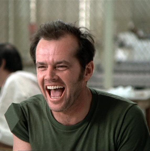
Randle is one of the most iconic example of rebellion in film and even literature, up there with Tyler Durden (Fight Club) and Holden Caulfield (Catcher in the Rye). The book was written in a time where people were constantly rebelling against the norm, and breaking the mold and pushing boundaries. Yes, the 60s was a magical time, and the rebellion of that era is personified in Randle McMurphy. Ken Kesey substituted Western Society with a Mental Asylum, and the Authoritarian Government was personified by Nurse Ratched, a cruel and wicked nurse that keeps the chronics and the acutes repressed under her tyranny. Until McMurphy comes along and raises hell. He questions authority, refuses constant medication, takes the patients out of the asylum to go fishing, and teaches the patients how to gamble. Jack Nicholson (who won the Oscar for his role) truly embodies the free spirit of the 60s , so much so that he is still iconic and relevant to this very day.

the best friend. - Francis Begbie - Trainspotting
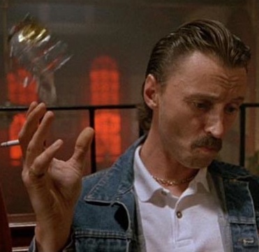
Robert Carlyle often plays serious, dramatic roles, for example: Hitler. But in Trainspotting he plays a dangerously insane, fould-mouthed and violent friend of Mark Renton (Ewan McGregor) and his circle of friends. The interesting thing about Begbie is that you can't say no to him. He threatens to stab Mark at one point and actually does stab another one of his friends at another point. He starts a bar fight by throwing a half-full glass of beer into a crowd of people and raises hell. He constantly picks bar fights for the most petty reasons, like someone distracting him at Snooker. All of this is rebuttaled by Tommy where he says "What can you do? He's a mate." With someone like Begbie, you don't say no to him.

the lost soul. - Jesse Pinkman - Breaking Bad (Season 4 and 5) 
For the first half of Breaking Bad, Jesse was the comic relief sidekick of Walter White. For the latter half, without meaning to spoil, he becomes a tortured soul. Endlessly tormented after he killed an innocent man to keep an illegal business going. He is essentially a harmless character, so when he is put out of his comfort zone, he becomes unstable. He becomes vague, distant, dissatisfied with life,  enough to throw thousands of dollars out the window of a movie car. He can't live happily due to the fact that all of his profit is 'Blood Money'.


the charmer. - Jack Cole - Sideways
Sideways is essentially about a week-long bachelor party, before Miles' (Paul Giamatti) friend gets married. Miles is a divorced and unhappy writer, but Jack (Thomas Hayden Church) is like a teenager in his 40s. He is constantly looking around for women, often for Miles' sake, but is often more successful anyway. Unlike Miles, who is serious and rather pretentious, Jack doesn't pretend, and acts like a child. He's forgetful, irresponsible and dishonest, but does have a way with the ladies. This makes him more of a human character with real flaws and vulnerabilities, instead of a
one-dimensional ladies man.

the professor. - Walter White - Breaking Bad
Walter White is an underachieving chemistry genius. Instead of staying at a company he founded which is now worth billions, he's a high school teacher. Due to recent news that he has lung cancer, he uses his knowledge of chemistry to cook Crystal Meth to support his family after he's gone. Even after his family is secured, he still cooks meth and risks his life. Why? When meeting up with his former colleagues who are now millionaires due to their successes, Walter is embarrassed by his lack of achievement in comparison. When cooking methamphetamine, he makes thousands upon thousands, feeling a sense of accomplishment. After all that studying of chemistry he did, he has finally found something that has value. This adds much more depth to his character, than simply an impossibly smart lab-dweller, which most 'mad scientists' in film fall under.

 
 the swashbuckler - Beatrix Kiddo - Kill Bill
This might seem like an offbeat choice for a swashbuckler. 1. She's female. 2. She's a ninja. 3. She's not Jack Sparrow, which everyone else chose. But the very definition of an archetypical swashbuckler is: The word swashbuckler generally describes a protagonist who is heroic and idealistic to the bone and who rescues damsels in distress. His opponent is typically characterized as the dastardly villain. There is a long list of swashbucklers who combine outstanding courage, swordfighting skill, resourcefulness, chivalry and a distinctive sense of honor and justice. By this standard, she fits perfectly, apart from the damsel in distress bit; you can ignore that. She's the main protagonist of the Kill Bill series, she's very courageous, she has immaculate sword fighting skill (as evidenced in the Crazy 88 fight), she's resourceful of her surroundings (again, see the Crazy 88 fight), and believes strongly in justice and honor. The main theme of Kill Bill is revenge, and this all ties in with justice for the perpetrators of her near-death, and honor for the discipline of warriorhood she's in. This makes her a particularly interesting character, as she breaks the mold of a damsel in distress and is the sword-fighting hero herself.

the warrior - Bruce Willis - Die Hard 
As the later Die Hard films descended into obscurity, the first Die Hard remains a prolific action film in the sense that it used an average Joe as their main hero. "Bruce Willis?" they shrieked, "You mean that TV actor from that awful rom-com series? No way will he make an action hero!"  But it was because of this that he was so successful. It wasn't an action film starring impossibly muscular body builders (Arnold Schwarzenegger, Sylvester Stallone), but it was about a regular cop thrown in to impossible situations. Unlike the later Die Hard films, he doesn't drive cars into helicopters, but has vulnerabilities and motives like real human beings do. He's just a good guy that wants to do the right thing, with a veneer of sly wit.

Thursday 3 October 2013

'Inception' analysis.


Christopher Nolan's Inception is an outstanding action movie. Not just in terms of quality, but in the way it distinguished itself from other run-of-the-mill, bog standard action movies released as of recent. It had a clever concept of manipulating dreams, and how that can be made meaningful in a way. For me, it's the best action film since Matrix, in the sense that it's viscerally entertaining and fun to watch, but also has a fair amount of thought put into it, using the theme of dreams to explore deeper themes, ideas and messages. This scene in particular revolves around a dream within a dream (the hallway) that is heavily affected by the dream that it's in (the car chase). The truck swerves and barrel rolls, causing Arthur's dream world (the fight sequence) to shift its centre of gravity. It's almost as if the hallway is on wheels and it's swerving and barrel rolling.

The spectacle, of course, is the constantly-shifting centre of gravity in the hallway, and the fight that happens throughout it. It's an original idea; having a standard, recognizable hand-to-hand combat sequence with the reaching-for-the-ever-moving-gun cliche thrown into the mix, but having the world shift and twist and jolt around it. The music is incredibly effective, starting out with a deep bass and fast violin, evolving into a faster tempo with ascending notes. The constant ascension of the notes ties in with the theme of anticipation. The tension builds up and up and up, until it abruptly ends, just as Arthur kills the last guard. The movement and shifting of the hallway is also random. We can see how each moment of the fight is affected by the change in gravity, linking to the next moment of action. The randomness of the world movement keeps us on edge, as a fight is taking place anyway.

The action alternates between hand-to-hand combat and a car chase that ends in a crash. The car chase revolves around a van full of people tied up to another dream world, so they're not conscious of the drivers dream world. The driver swiftly escapes oncoming threats by pulling men off bikes and using the traffic to his advantage. The danger here is twofold: the threat of Arthur being neutralized by security guards, or the car, with all the vital characters on board, crashing and killing everyone inside, locking them inside someone elses dream forever. The car chase physically effects the hallway scene, as opposed to two separate action scenes going on at the same time, causing two ongoing threats.

By this point, the audience is either nauseated or engaged. The tension caused by the two ongoing threats may lose audiences, but this scene is relatively manageable compared to the rest of the film. The rest of the film switches between a dream, a dream within a dream, a dream within a dream within a dream, etc. It's sometimes hard to keep track, but this small moment of 3 minute action lets the audience forget all the previous confusion and let them enjoy something everyone understands: violence. If this film was a cerebral drama that still revolved around the idea of dreams within dreams, I doubt it would have succeeded as much as it did. Weaving in action with cerebral set pieces can appeal to two audiences at once, entertaining the smarter film audience in a different way to the common film audience. Even if you didn't understand the film, a simple hand-to-hand combat scene with a cool twist, will engage you no matter how high-brow you consider yourself.

Leonardo Di Caprio plays the main hero of the film, Dom Cobb, but this scene revolves around his assistant, Arthur. He's initially sent on a recruit mission, but encounters problems along the way, with the drivers world constantly affecting his world, and the trouble it takes to neutralize Ken Wantanbe's character, Saito. He has an overtly suave attitude when dealing with stressful situations, and can easily navigate a room where the floors are ceilings in a matter of seconds. Despite not having a word of dialogue in this scene, actions define a character. With that thought in mind, we see that Arthur is incredibly capable, smart and tactical. There's more character development in the rest of the film, but this is where he shines as a character, taking on the seemingly impossible task of pulling off a flawless combat sequence in a nausea-inducing hallway. He is made to seem like the only competent one in this scene, with the security guard constantly tripping over and Saito falling into an elevator door.

This is one of the better action films out there, with all the pointless Transformers and Fast and Furious sequels out there, at least Inception has a brain. A confusing, twisting and often frustrating brain, but a brain nonetheless.


Wednesday 25 September 2013

reading lynx.

In doing Media Studies for not even a month, I have noticed the rampant objectification going on in the media. People starve themselves and pack into gyms so they can look how Calvin Klein and Tommy Hilfiger tell them to look. It sends out a horrible message that women are merely used as 'tools' to market their unrelated product. And like all 'tools', they have their place. They're used to sell their unrelated product, and when not needed, they're put away and saved for later, probably when they're needed to sell another antiperspirant brand.

We can see in the background that everything is 50s-style. The retro radio, the retro oven, the retro decoration, it all links back to the 50s or early 60s. This was a time when women stayed in the kitchen, did the house jobs, and the men were successful, $1400 suit-wearing, 9-to-5 office job-types with a possible drinking habit. Either this advert is contradicting the modern woman with the old-fashioned, kitchen-dwelling women of yore, or it's setting gender conventions and expectations back another 50 years. With the obvious sexualisation of said woman, I'd go with the latter.


A textual analysis for this is important. It's not just a sexy lady on an advert, it symbolizes something more. "Can she make you lose control" for example, placed directly about "Full Control" which is what Lynx is selling. This woman is the temptation, the antagonist in this certain situation. We all have urges of sorts. Be it a societal urge or a sexual urge. What this advertisement is selling is full control over your urges, as well as a simple product. This woman is the one that will break the control. It's also hinting that by using Lynx, you will attract a woman like this. False, of course, but impressionable teenage boys is a huge market that Lynx is willing to exploit purely for their bottom line (money).

Adverts like these don't anger me as much as they depress me. Is this really the way of the ad industry? To prey off our most basic instincts, heightening our expectations and further pushing societal pressure on the unconventional? Or is this merely a common case of me looking too deeply into things? Possibly that.

Wednesday 18 September 2013

lucozade and lara croft.

At the beginning of the lesson, we discussed the 4 different viewpoints on the media, and how it can affect the consumer. This topic sparked from a recent story about a man who was stabbed and robbed of his copy of the newly released and highly popular Grand Theft Auto 5. This certainly caused a debate around certain news sources about violence in video games reflecting violence in real life. This story was reported after merely 3 weeks after the series was blamed once again for inspiring an 8 year old to shoot his grandmother in the back of the head. The series (and violent video games in general) is a hot topic when coming to real life violence; gamers read it, politicians read it, scared, conservative housewives read it, etc. There are many reasons that break down why video games don't have an impact on real life violence, but the topic crops up anyway. As a gamer, I feel insulted when someone criticizes our medium as a 'way for kids to waste time' or a 'dangerous drug'. These days, video games are as legitimate an art-form as film or television or literature. Phil Fish describes gaming as "The ultimate art-form. The ultimate medium. It's the sum total of every expressive medium of all time - made interactive." It's a shame that most people don't see that as much as I do. Anyway - LARA CROFT.

After defending gaming in a lengthy paragraph, we turn to a Two-Dimensional character from a mediocre game endorsing a soft drink that I don't really like. But this isn't up to personal taste; the ad-execs at Lucozade certainly know (or at least knew) what they were doing when putting the fictional Lara Croft at the head of their marketing stunt. Despite me disliking Lara Croft (her being the benchmark of video game objectification of women and her 'tomb raiding' without justification or any use for her relics) she was a popular face at the time, with 2 feature films about the character a few years down the line. Of course the main demographic for video games (at the time) and fans of Lara Croft are primarily male. I'm just speaking for myself here, but I see more men drinking Lucozade and all of its spin-offs consumed by men than women. Marketing Lucozade for men isn't a bad thing - if your audience is mainly male anyway, you might as well appeal to them more aggressively - but it does leave out a large demographic.

This advert was unique at the time for being computer animated. Most adverts you see today have some use of CGI or otherwise computer-altered images, but in 1999 this was a relatively new innovation. It's certainly a risk to take, as 30 seconds of 3D animation and rendering can take quite some time, but the fact that it was so new and fresh at the time made up for all its flaws and foibles. Of course it promotes Lucozade in an exceedingly positive light: you're stuck, drink Lucozade, problem solved, etc. But it does so in a unique way. Faced with live threatening situations (fictional, of course), drinking a Lucozade will get you out of it.

I'm not a fan of the character or the drink, but what Lucozade did here was clever. I don't think I've seen a fictional game character be the face of a marketing ploy before. It makes a lot of sense though; she's just like a regular celebrity, but she doesn't say or do stupid things in public, and she's a fantastic stunt actor.

Wednesday 11 September 2013

'Share a Coke' analysis.

This is the recent 'Share a Coke' advert, launching Coca Cola's new marketing campaign of putting names on Coke bottles. It's an original idea that can potentially generate a lot of revenue. The advert itself is quite basic, with a handful of people talking about who they would share a Coke with. This particular advert, unlike Hilltop, portrays the people as real people, not just singing robots holding a coke. These are real people with personalities and accents and reliability. Most of us can relate to having an annoying sibling, but you still love them. We can relate to having a really good friend that we would like to 'Share a Coke' with.

Instead of these people giving scripted, by-the-book, robotic responses, they seem like real people you would normally see on the street or in school. They have imperfections and character traits and all the squishy stuff that makes a human, well, human. Instead of this being in the form of text, like a 'This person feels strongly about this person' type deal, they're actual people expressing their opinions in a manner they would ordinarily use to speak to their friends or peers. This is in effort to make Coca Cola seem like a more relatable, approachable and friendly corporation, and not the massive, conglomerate, globalized corporation it actually is.

The aesthetic of the advert is youthful, as if Coca Cola are part of the young age fueled by hashtags and selfies. Sure, it keeps the old colour scheme of Coca Cola (see the red and white background), but the people are young, they talk like young people the song ('Tongue Tied' by Grouplove) is a relatively new song, the fashion is recent, hell, almost everything about the advert is youthful, and it all serves one purpose: to make Coca Cola seem more in touch with the young audience. I mostly see teenagers or generally younger people drinking Coke, and if the company was out of touch with that audience, then surely that audience wouldn't drink Coke anymore. Whereas other companies and corporations aren't in tune with what the younger generation (I'm looking at you, Newspaper industry), Coca Cola is thriving off of this generation because of this advert and their entire marketing technique. They incorporate modern art styles and more efficient, less-expensive ways of reaching a large audience, either through hashtags or YouTube.

The idea of putting a name on a Coke bottle looks promising. I often see people fishing through Coke stands, trying to find their name or their friends name, attracting a larger audience of people who enjoy the novelty of having their own name on a Coke. Coca Cola is a huge company, too huge, incredibly huge, and to have your name on a bottle containing the most consumed soft drinks in the world, gives you a feeling that you are special and are noticed by this Multi-national corporation. People fish through many a Coke bottle to find their name, and post a picture of their personalized bottle on Facebook or Instagram or social network of choice.

The best part about this campaign is how simple it is. A name is simple. We can all remember the names of our friends. How much does a Coke label cost to make anyway? Maybe a little more that your standard Coke label, but compare that to the amount of revenue Coca Cola have made through this marketing campaign, and the cost of an individual label is insignificant. With this marketing campaign, Coca Cola feel less like a huge, conglomerate corporation, and they feel more personal.

Coke is a really clever company, and so far they're doing really well with this campaign. A few bad press incidents or a PR nightmare won't be enough to destroy Coca Cola at this point. They're too successful and too clever to lose any kind of popularity at this point. Incidentally, I want a coke now.

Monday 9 September 2013

shot types and cinematography.

This is the opening, establishing shot of Stanley Kubrick's A Clockwork Orange. This close up shot establishes that this man is the main character of the film, but then the camera proceeds to zoom out from the close up, revealing the room that Alex (the main character) resides in, whilst still keeping Alex at the centre of it all. This symbolises Alex as being the centre of the world of A Clockwork Orange, despite the fact that it's hard to see him when the camera fully zooms out.

This is a two shot from the opening of The Social Network. Previously in the scene, the camera alternated between Mark Zuckerberg and Erica Albright via over-the-shoulder shots, hinting at a disconnection between the two.The camera only does the two shot twice in the entire scene, when they stopped talking. Most of the shots in the movie depict Mark Zuckerberg in a separate shot from everyone else, also hinting that he's disconnected from everyone else.


This is a wide-angle shot from Indie Game: The Movie. This shows, via a wide angle shot, the environment in which the game developers live. They live surrounded by posters and photos and references and computers and technology etc. They live in a little room, designing a game that will one day sell millions. A huge conclusion starts with a small, pop culture-filled room. 


This is an extreme close-up shot from Dead Space 2. Despite being a game, shots still take effect, and angles take a huge effect on the game as a whole. For instance, first person shooters like Call of Duty or Portal have their entire game played through the viewpoint of the main character. Third person games like Dead Space or Spec Ops: The Line have their game take place from the third-person perspective, having the game camera set over the characters shoulder. This is used for either gameplay or artistic purposes. This is a close up shot of the main characters mask. Because the game is survival horror, most of the scares rely on claustrophobia, which is expressed through this shot. We are so close to the main characters face, it's uncomfortable, inciting claustrophobia, which is one of the main themes of the game.

Of course there is a multitude of shots you can use for a game or a movie, but these are just a few shots you can use which are most often used in movies or games.  

Friday 6 September 2013

the first lesson of media.

I opened up this blog for the primary purpose of my Media Studies coursework. This is where I document what we did in class, certain homework assignments and some other optional stuff. This is my second blog, my first blog being here, where I write essays about games and suchlike game related topics, so naturally I have some experience with Blogger and its in's and out's. I generally enjoy subjects like English and Tech because I like to write. It's something I enjoy doing in my spare time, and it's a good way to express my opinions to a large crowd. My other blog is nearing 600 pageviews, which isn't loads, but it's a start. My spare time mainly consists of watching movies (in which I have seen hundreds and can name every Academy Award for Best Picture since 1959 off by heart) and playing video games (in which I am trying to develop one. Or at least trying).

In the lesson today, we were told what out first piece of coursework was going to be, and it's advertisement. We looked at an advert for Listerine in the textbook, and analysed what gave that advert its persuasive qualities. It had a woman, holding a cloth in which she would cry into, looking all weak and pathetic, mainly because she doesn't have a husband. This plays off sexist gender conventions that all women should aspire to be a fine wife to a successful husband, and that turning 30 is something to be ashamed of. In order for Edna to get the perfect husband, she needs to use Listerine to solve her halitosis and be the ideal female. Here we can see that these gender conventions have been engraved in society through the media. Your televisions and your advertisements all say that women should be a certain way, and that all women will be incomplete without Mr. Right.  And that you will be a certain way and you will meet Mr. Right if you give our company some money. It's odd to see how society and genders can be so affected just because some companies want a bit of money.

Despite taking approximately a billion years to load, we also watched another advertisement, promoting both Coke Zero and James Bond. It was obviously targeted at men, due to the gratuitous amounts of skinny-waisted, large-breasted women dancing around the place, and due to the amount of violence and car chases going on at the same time. It was an exercise in seeing how many bored, teenage boys you can appeal to at the same time, by having the most stereotypical and generic interests as possible. 'Hey, what do bored, teenage boys like?' 'Girls! Violence! Car chases! Carbonated, low-calorie drinks!' Those Ad Execs must have been very proud of their painfully obvious discovery.

I'm not demeaning the advertisement industry as a whole, just these two adverts in particular. I'm not saying they don't work, because they do, but it doesn't send a very positive message about gender conventions. But hell, that's just my opinion.